The core philosophy behind any design system is
Atomic Design. We break all web elements into Atoms, Molecules, Organisms, Templates and Pages. Frameworks such as React lend themselves to envisioning our projects as complex interfaces comprised of small building blocks.
It was essential that the library get buy in by every team at DAT. The eventual goal was that
any developer, new or old, could plug into another team's product and feel confident that they had the baseline knowledge and tools to start working.
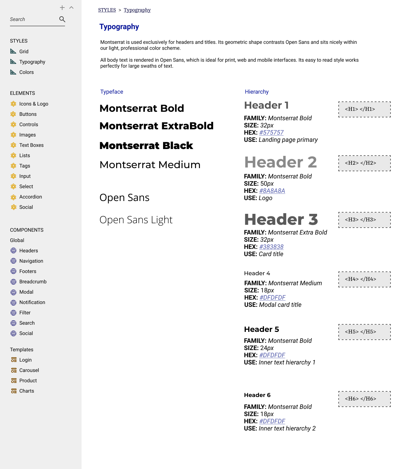
The library provides developers with an intuitively organized library of components of every level of complexity, from buttons to headers to full modules.
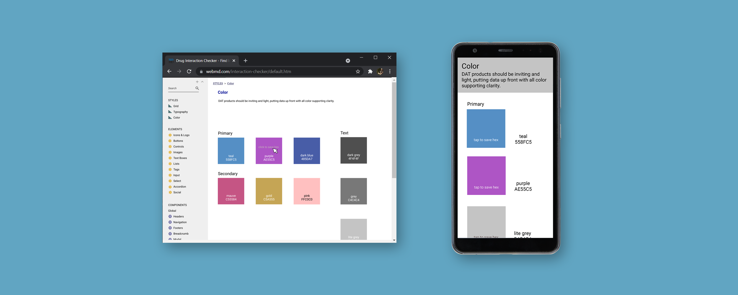
We wanted our index and groupings of elements to follow common best practices, but it quickly became clear that the library needed to also honor the historical systems used throughout the company. By interviewing our internal staff, we created a hybrid system that was popular with both stakeholders and developers.
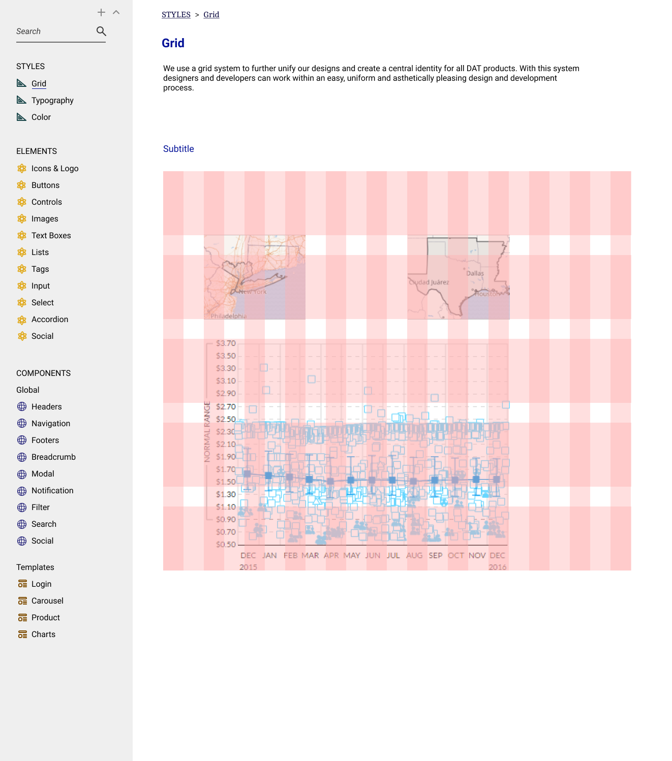 We ultimately decided on a 16 column, 8pt grid system. Our designs going forward were created with a modular philosophy and responsiveness in mind.
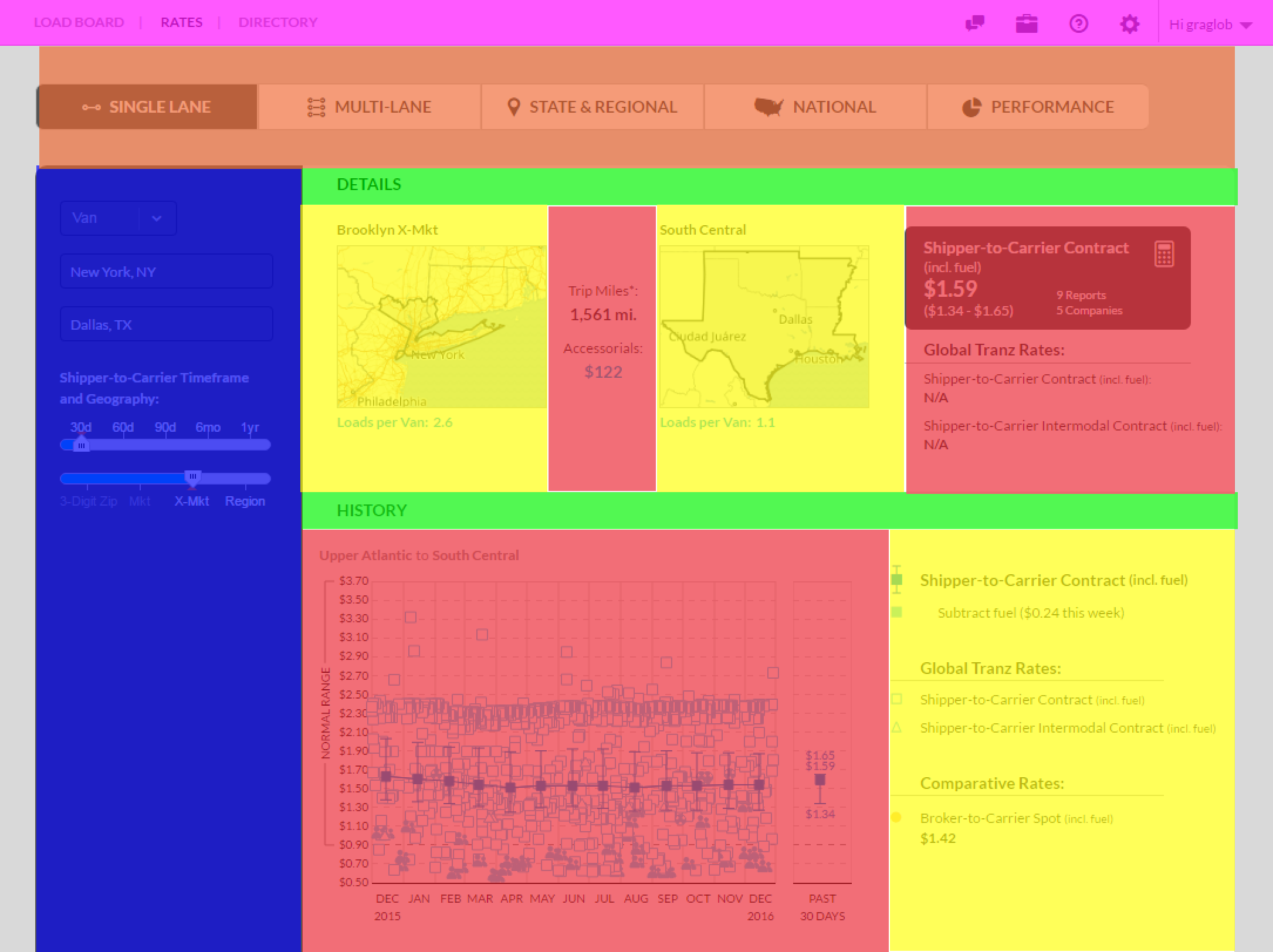 All tools designed as flexible modules for easy rearrangement.

