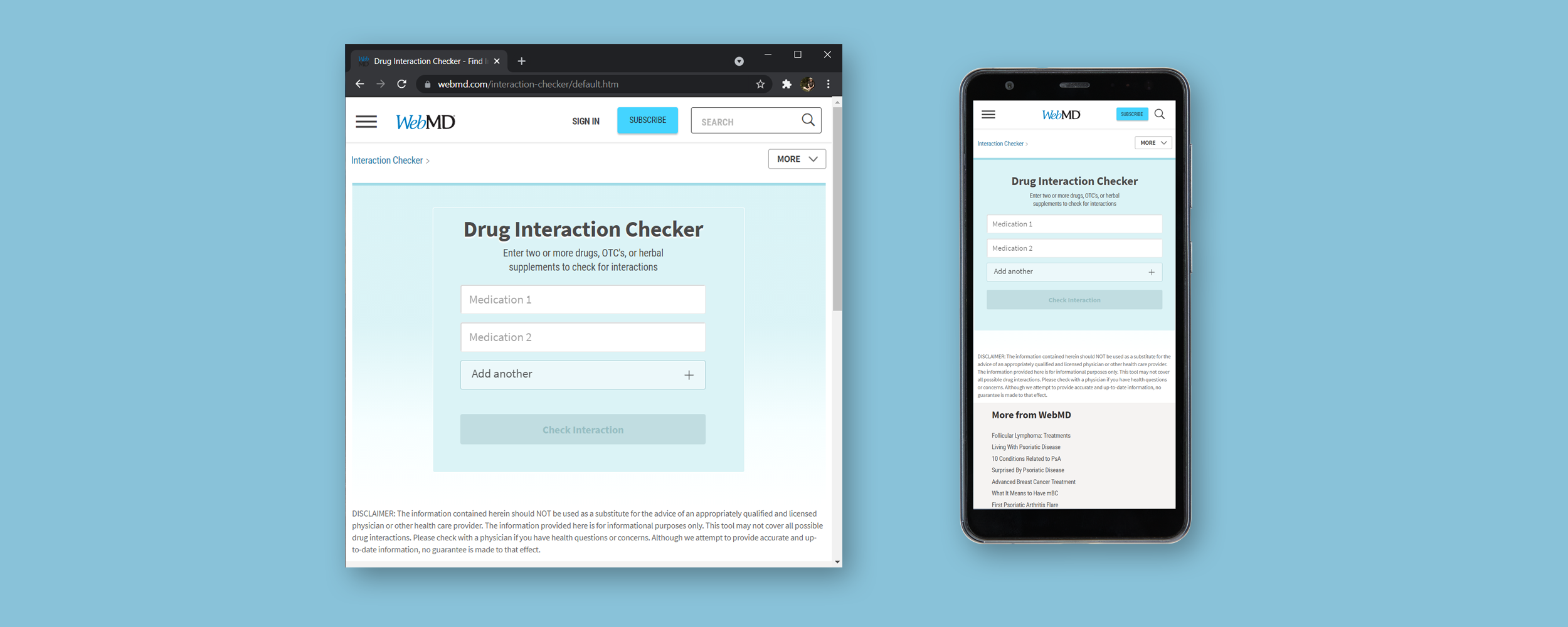
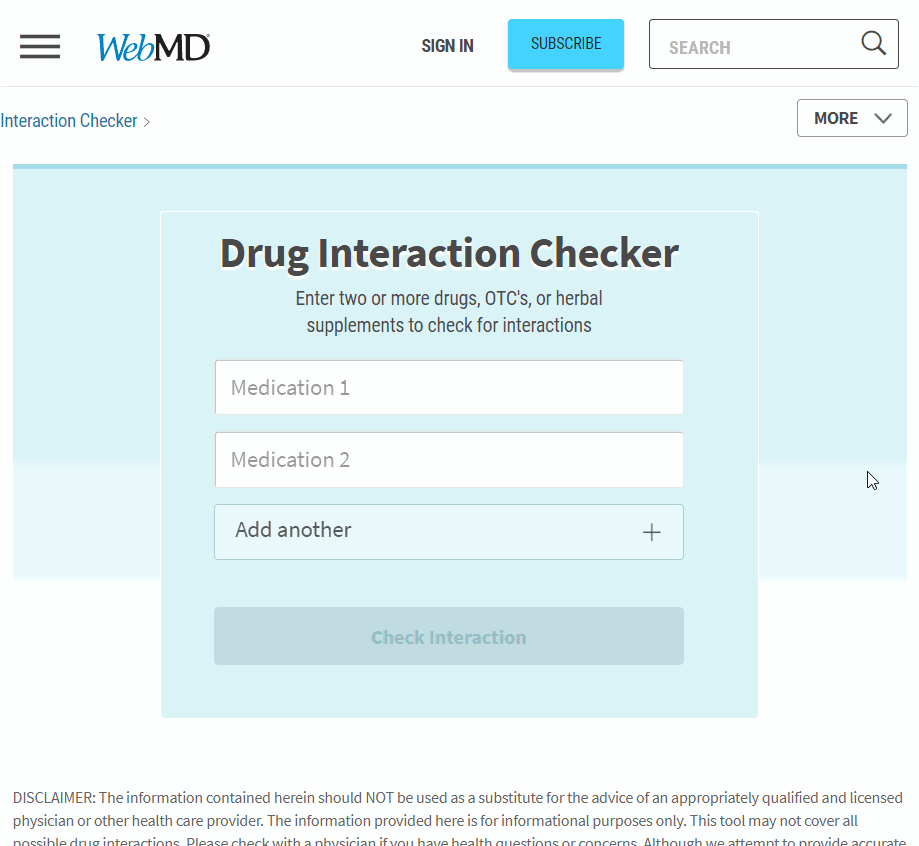
The Drug Interaction Checker is a key piece of the WebMD medical suite, which helps consumers find crucial drug interaction information, giving them piece of mind that they can safely use their prescribed drugs together, and answers their concerns and questions. The original tool was a clunky single input that took multiple clicks and page loads for the user to find their information.
My goal was to identify the product's usability issues and redesign the tool to be more intuitive and user friendly.
WebMD had limited time and budget to update this vital tool. I was tasked with finding and implimenting a solution quickly and elegantly.
Understanding the Problem
WebMD released the original version of the Drug Interaction Checker six years earlier as a minimum viable product, and it hadn't been updated since. It functioned as simple database inquiry and outputted basic interaction infomation with little context. While the product functioned, it had been created without usability testing or user input.
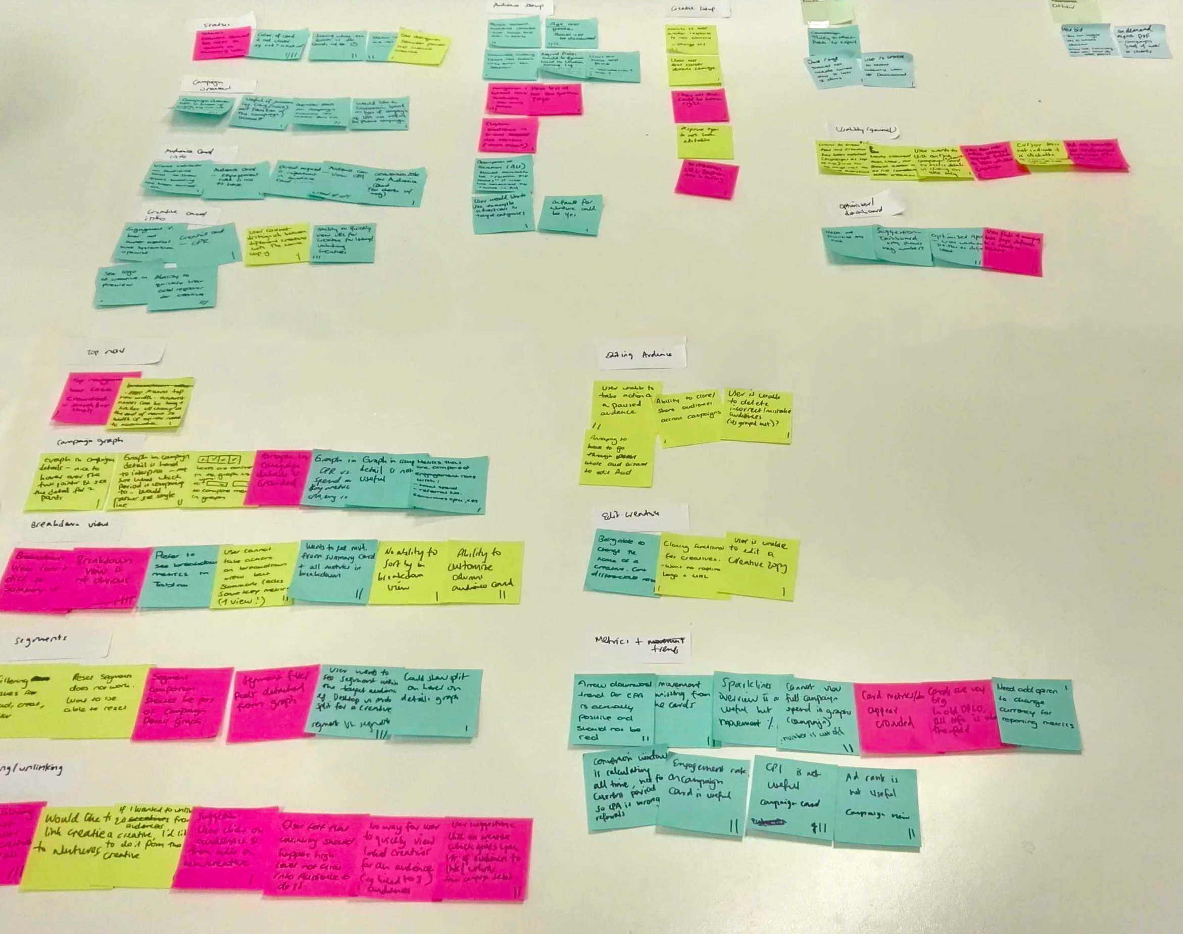
After determining primary pain points, I distilled years of feedback into common buckets and created an internal team to comb through the data and identify primary functions.
Research strategies:
Discerning the user's goals and needs
Identifying pain points within the existing app
Determining the user's success ratio using the app
Gathering insights
Given how long the tool had been available, we had years of feedback. I identified common pain points and conducted affinity mapping with my teammates to flesh out our primary focus, grouped into common themes and features.
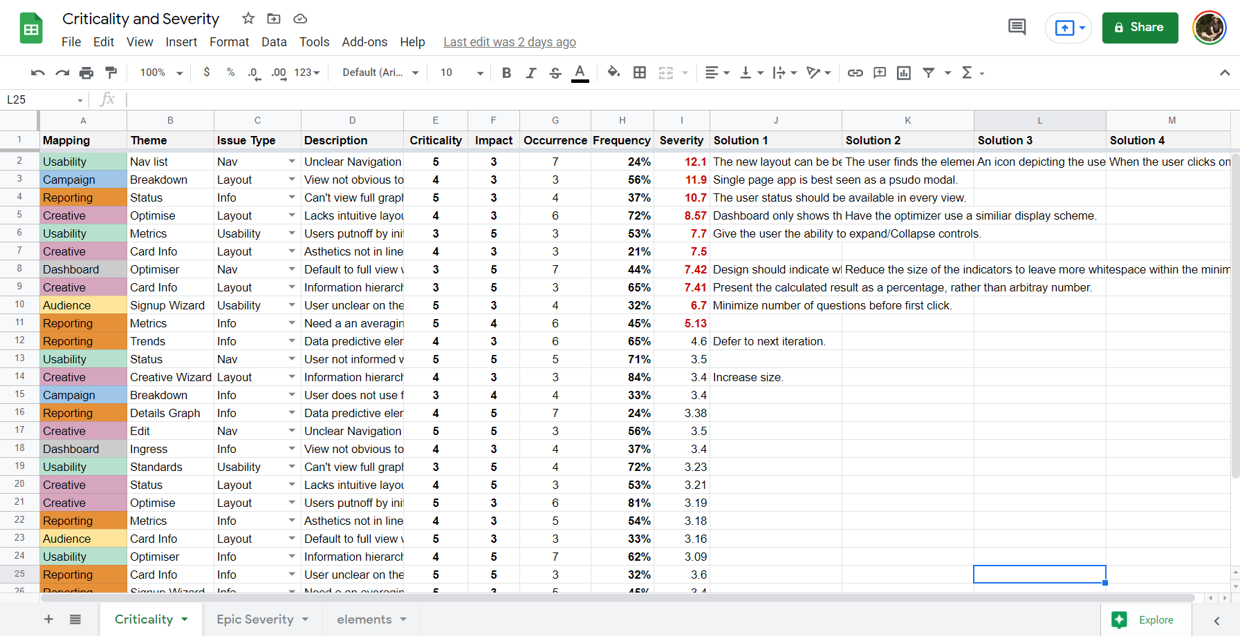
Criticality
We used a severity framework to prioritize usability issues. This framework helps identify a quantifiable usability issue rating based on:
Task criticality x impact x frequency = severity
Task criticality - how important is the task to the user?
Impact - how much of an impact does this issue have on the user's task?
Frequency (%) - how many times does this come up out of total participants?
Issue Prioritization
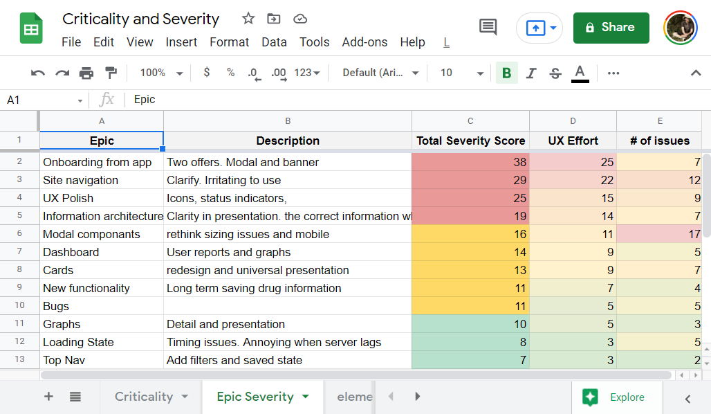
Given the project's scope and WebMD's budgetary considerations, I created Epics to provide the Product Manager and Developers with a prioritization framework. I synthisized our findings to create a new minimum viable product that could be developed within our timeframe, including my own prioritization from a usability standpoint. This was useful in the longterm, but also helped shape the product road map for the quarter.
Product, Design and Development concluded that the first Epic would prioritize the user's interaction with the interface, with an eye toward intuitiveness and speed.
Wireframing the Solution
Based on our research and prioritization, we began presenting potential solutions to the team in these key areas of focus:
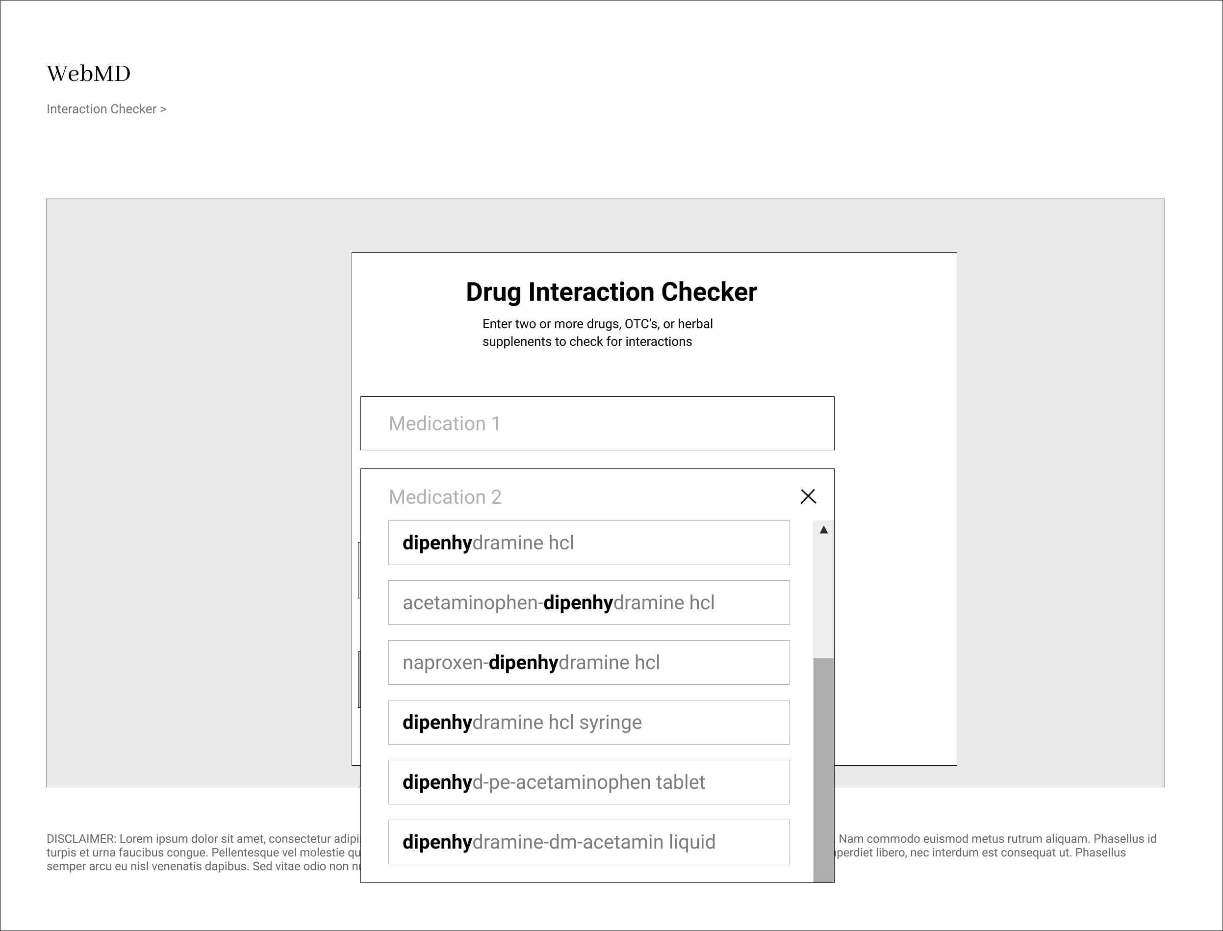
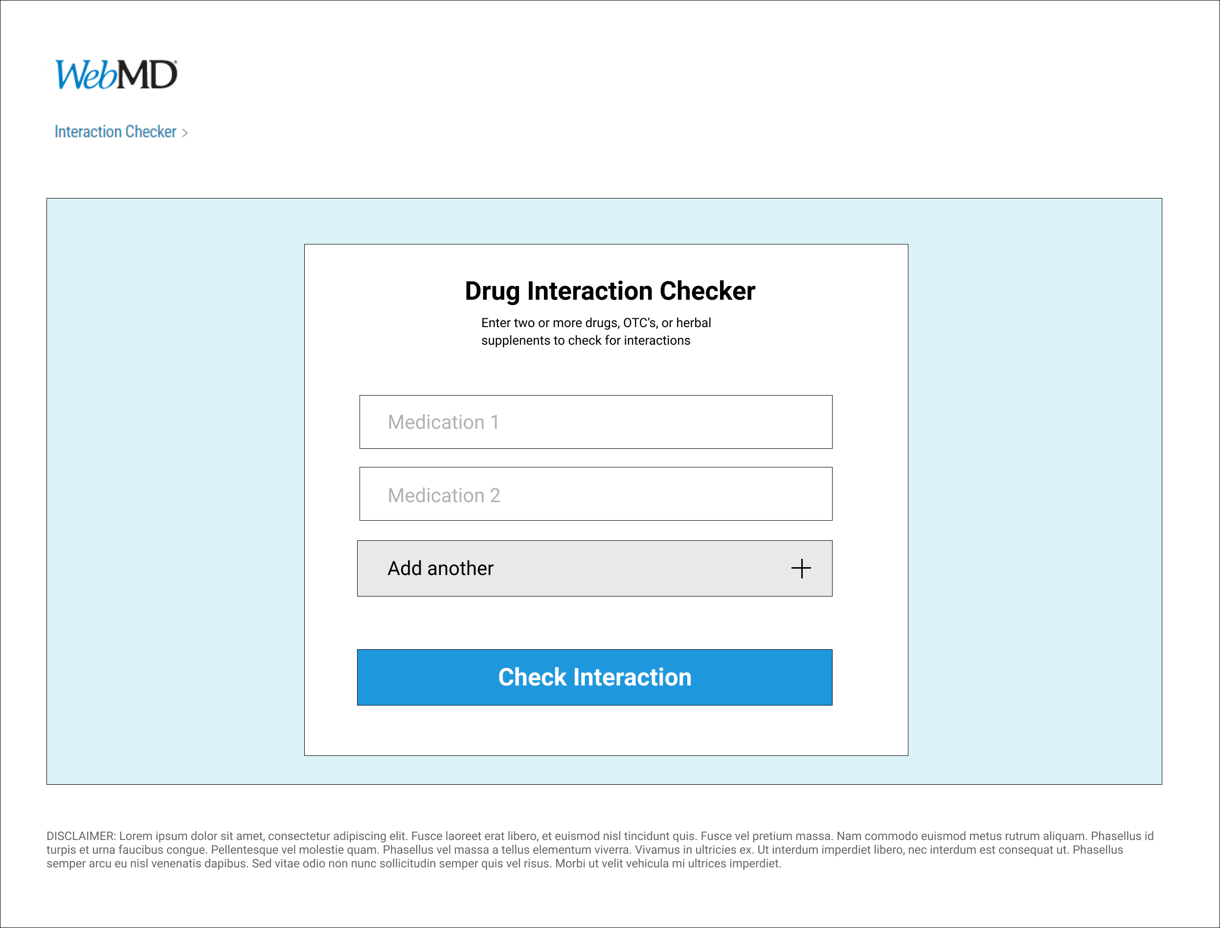
Reducing the number of steps to output
Building an intuitive autofill function and error validation
Establishing a cleaner, more friendly interface
Standardizing common styling and UI patterns
I quickly mocked up low-fidelity wireframes to educate and gather feedback from the Product Owner and Development on the layout and structure of the app. This involved establishing a standardized visual hierarchy and layout for the component.
Validating the Designs
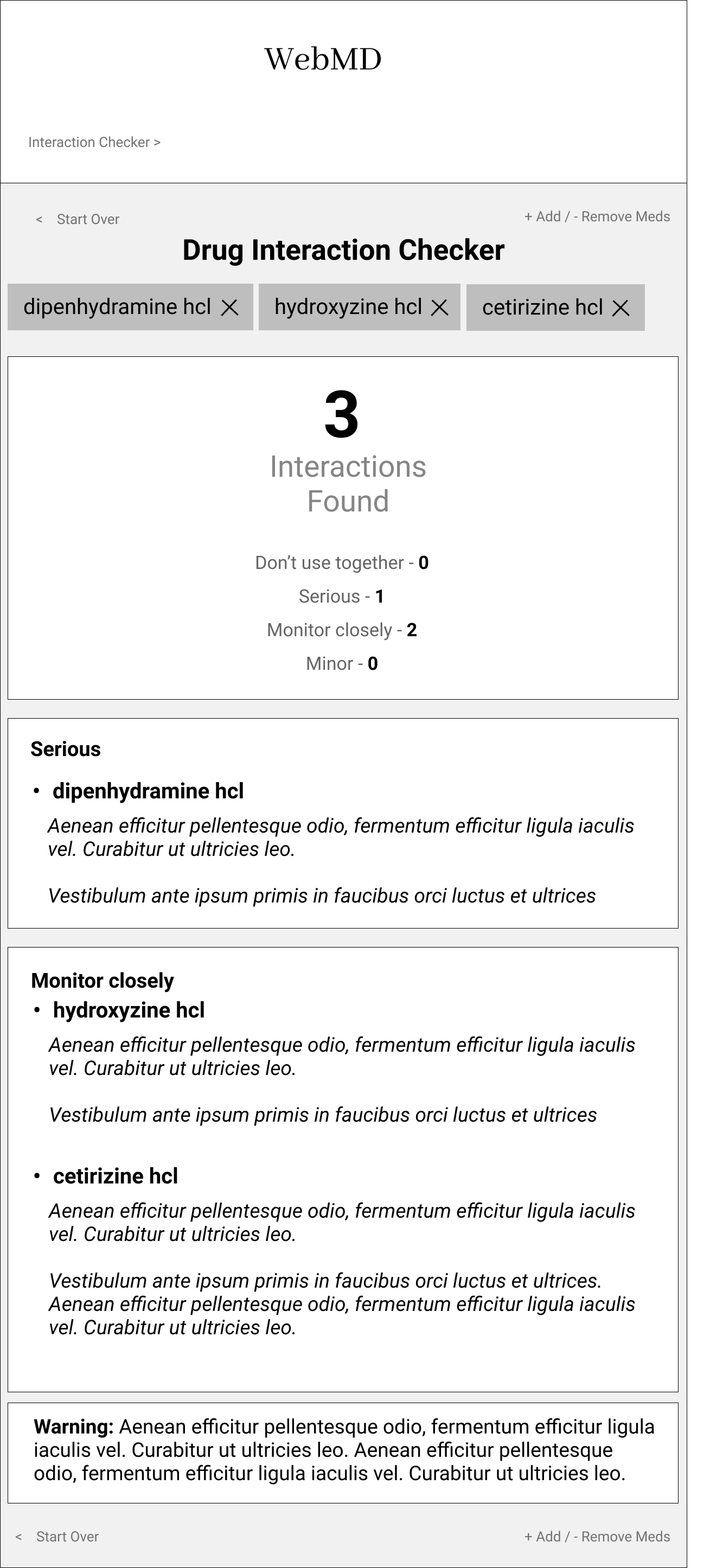
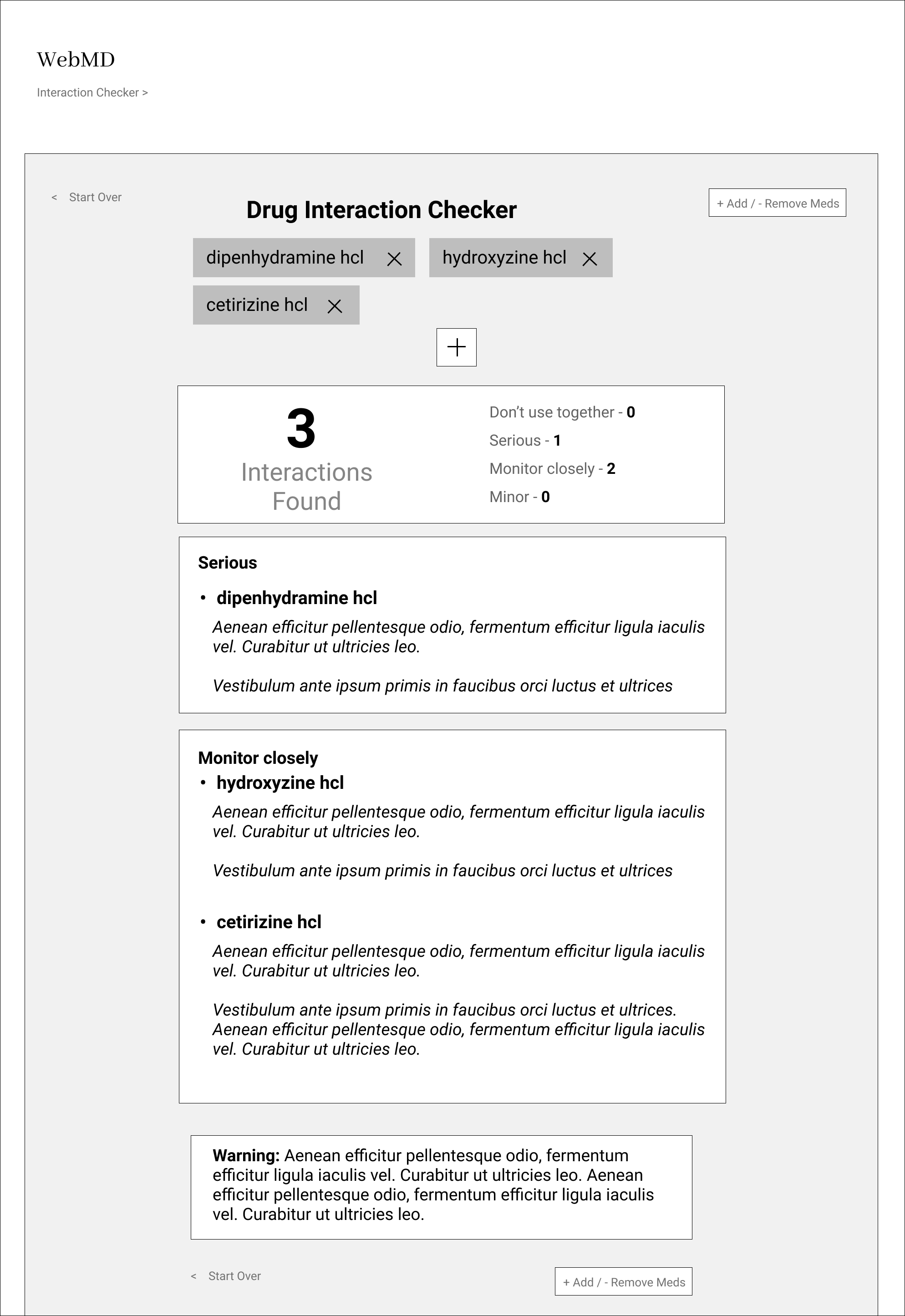
I conducted usability-testing sessions with internal users. During these sessions, I observed how they interacted with the prototype and noted their velocity and questions. The usability sessions revealed that our new design made it faster and more intuitive to get to the information the user needs. With a few tweaks, we found that users found the tool intuitive and comprehensive.
Developing the Designs
I recreated the tool in HTML, CSS, and JavaScript and used this as a mock-up for stakeholders. Other Frontend Developers incorporated this into the larger WebMD medical suite. Throughout the development process I maintained UX reviews of each ticket to ensure it was aligned with designs.
We collected data on the app through user feedback and interaction statistics. Use of the tool increased while negative feedback decreased. User feedback particularly focused on the ease of use and presentation of the information they sought.
Outcomes
Some key takeaways from the project
Rebuilding the app reinforced the importance of gathering user insights and focusing development around data-driven features and improvements. This minimized out-of-scope requests and helped us deliver a quality product on time.
User testing doesn't end after development. Design is a constant iteration of improving the experience for the end user. Always find ways to collect and listen to your user's feedback.
Involve engineering up front. This helps reduce wasted effort. Understanding the technical limitations up front helps inform the design strategy.